My most recent work as a Web Specialist at New Relic had me creating new web pages, updating existing pages, and helping design for our conversion rate optimization program. With UX work, I partner with different stakeholders to gather requirements, do competitive research, dig into page analytics, and then create a wireframe in Figma. After multiple rounds of reviews, a final wireframe is approved and I then hand that off to the design and copy teams to write the page copy and create high-fidelity mock-ups and imagery. Once the copy and imagery come back from those teams, I will build the page out in our content management system. Below are some of the pages that I have taken the lead in designing.
Practices Template
This is a new page template that will be used for a series of pages that go over observability best practices. The primary goal of this new page type is to convey information and lead users to resources and documentation that help align their businesses with industry best practices. The secondary goal is to frame New Relic as an expert in best practices and drive customer trust and company adoption.


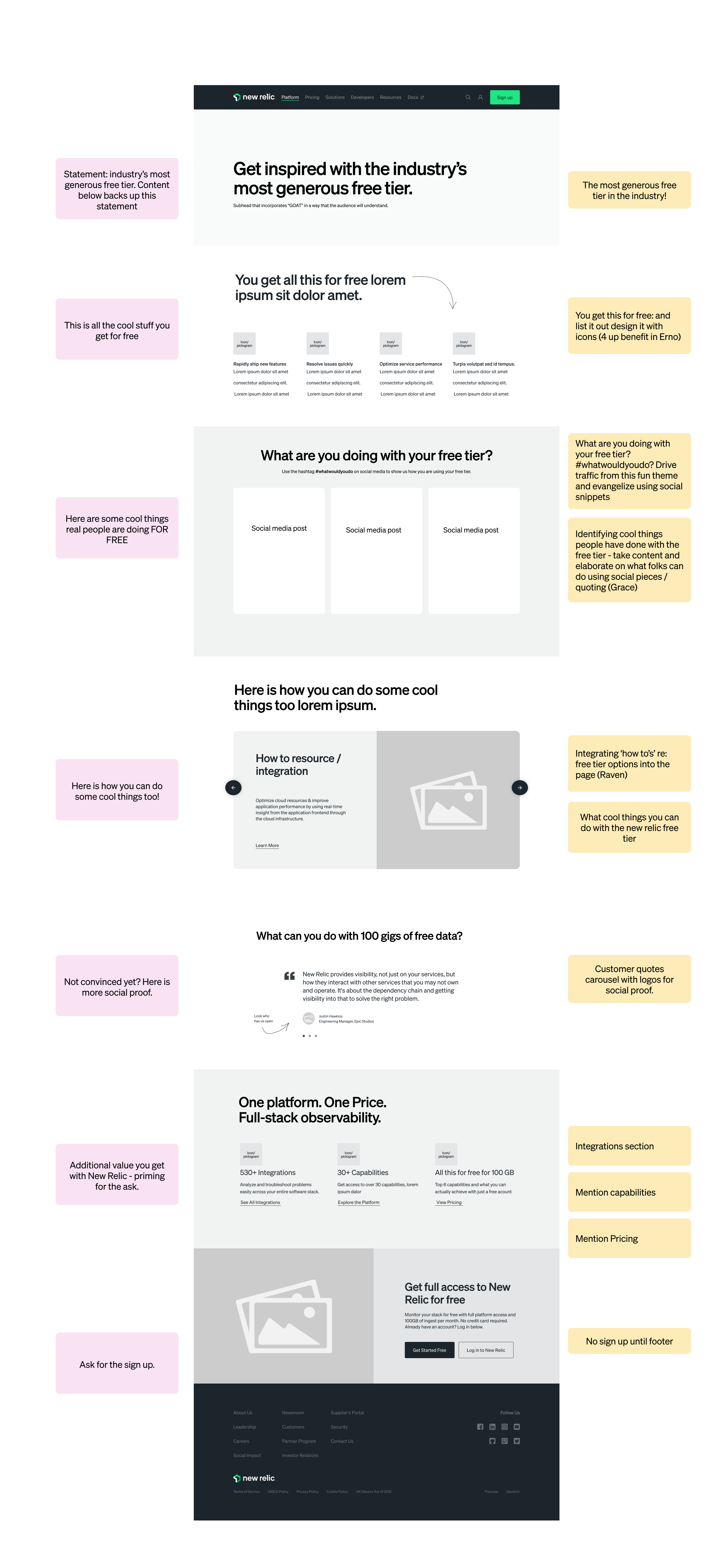
Free-Tier Page
The goal of this new page was to show customers how much they can do with the free tier of New Relic, and convey how New Relic has the most generous free tier in the observability industry. This page was part of a new campaign that has so far been successful at driving new account signups.


Customer Landing Page
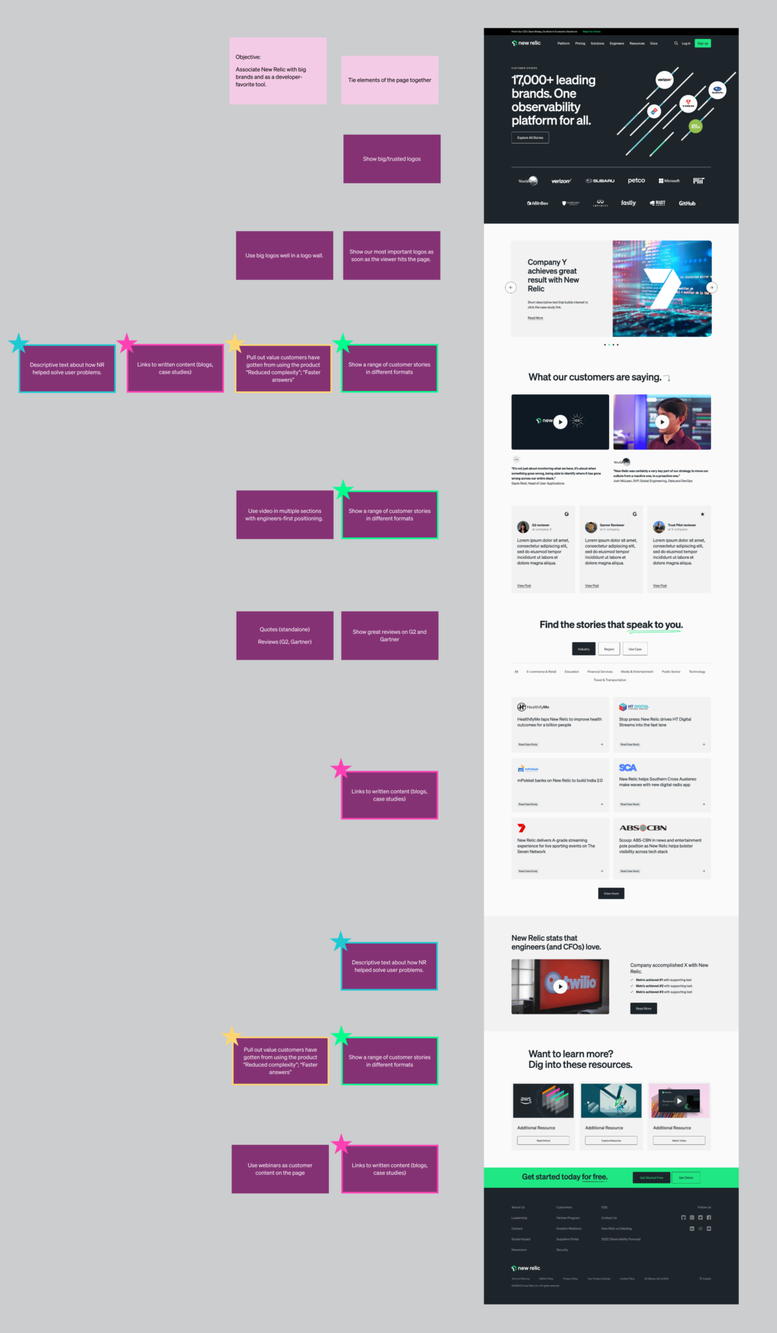
The customer landing page is where all of New Relic’s case studies and customer stories live. My challenge in this project was to update the existing page to improve the market perception of New Relic by associating the company with big brand names and as a developer’s favorite tool. This page was mocked up in Figma using our design pattern library and then shared with the customer team for feedback before being built.
I worked closely with the copy and customer team to tell a compelling story through the case studies and imagery was chosen. When the outline was drafted and the imagery was chosen, I built the page in our content management system. The new page achieved the goal of increased market perception and has seen an increase in sign-ups month over month since the redesign.


Pricing Page Simplification
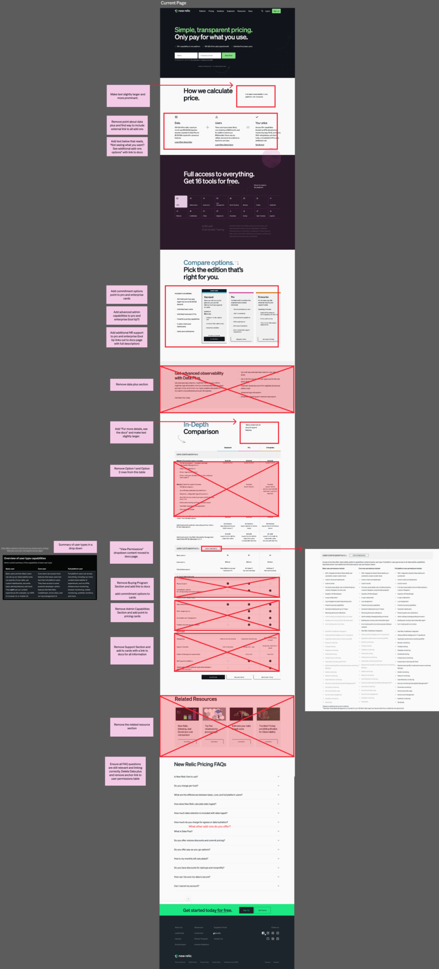
Recent user interviews and analytics showed that the pricing page was not performing as well as the company would like and that we were missing out on a lot of potential signups. My team was responsible for increasing signups and reducing customer confusion with a more simplified version of the pricing page. We used data from interviews, heatmaps, and analytics to decide what information needed to be moved to a secondary site, and what needed to stay on the page. My simplified pricing design was rolled out as an A/B test that won and was implemented.

A rough draft showing proposed changes to the pricing page

